Based in Reggio Emilia
contact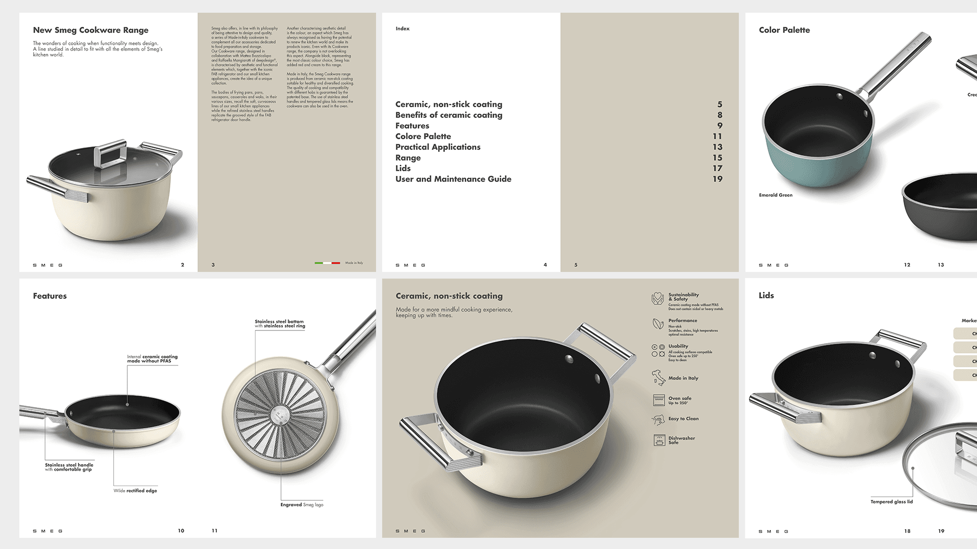
SMEG — Book
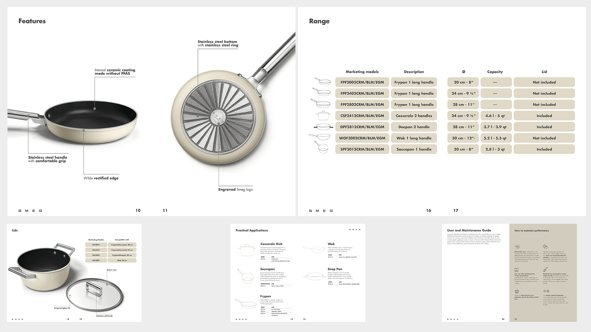
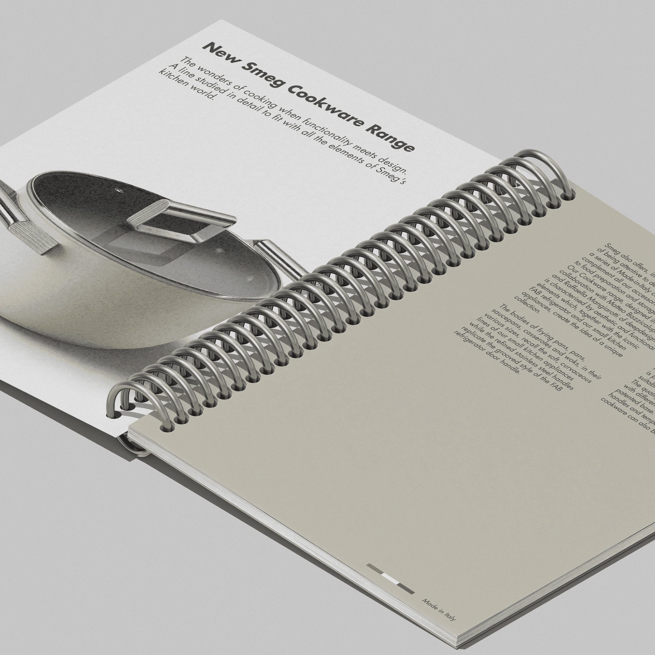
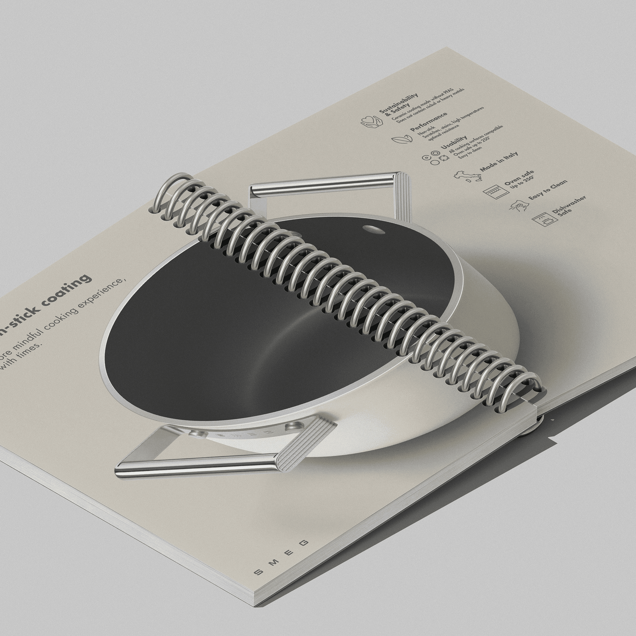
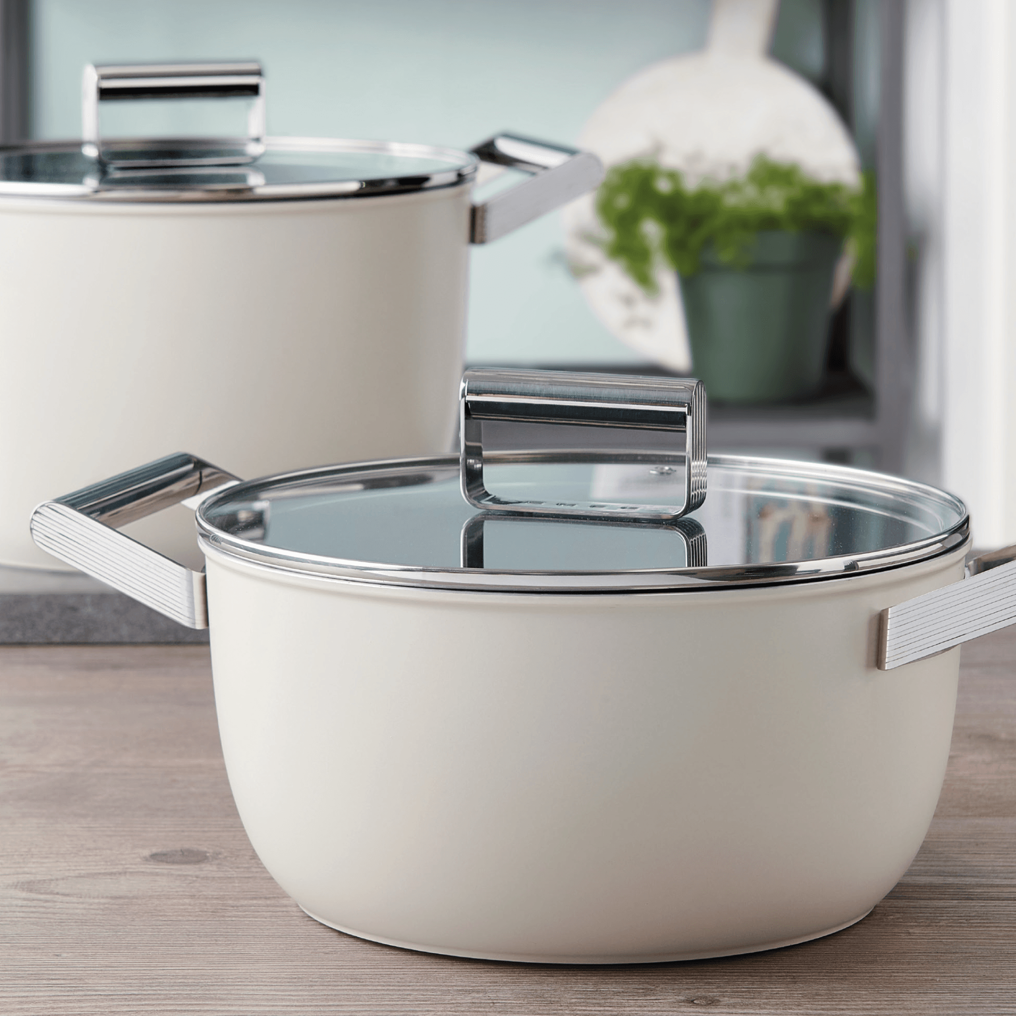
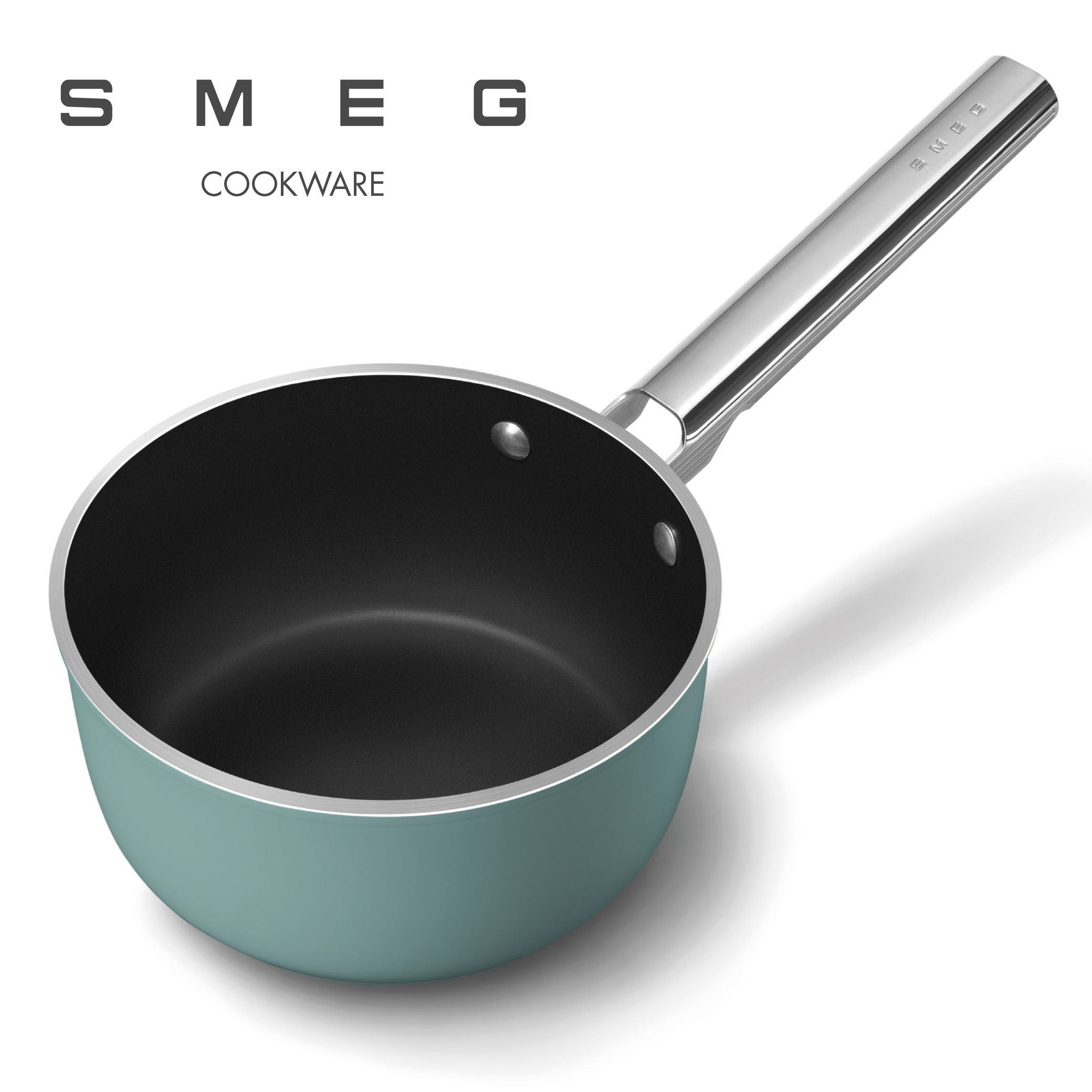
Creative Direction & Editorial Layout:We designed the grid system and editorial layout for both the product catalog and the user manual, creating a refined, readable, and cohesive visual experience that reflects the brand’s premium positioning. Photo Selection & Curation:We led the curation of the photographic content, balancing inspirational lifestyle shots showing the cookware integrated into modern kitchen environments with detailed product imagery that highlights craftsmanship, materials, and color variants (Cream, Black, and Emerald Green). Icon & Information Design:To make technical specifications intuitive, we designed a custom set of icons and infographics. These clearly translate complex features such as hob compatibility, thermal resistance, and ceramic coating benefits into accessible visual key points. User & Maintenance Guide:We structured the practical user guide, transforming technical instructions, safety guidelines, and care recommendations into a clean, functional, and visually engaging booklet for the end consumer.
Il progetto Cookware 2.0 rappresenta l'evoluzione della linea di pentole e padelle targata Smeg, sviluppata in collaborazione con lo studio di architettura e design deepdesign® For the launch of the new Smeg Cookware 2.0 collection, our studio handled the complete visual and editorial design, shaping the graphic language for the product catalog and the comprehensive user & care guide across the entire range. The project required a seamless balance between Smeg’s iconic aesthetic heritage (Made in Italy, retro-contemporary design) and the need to clearly communicate key technical innovations, such as the new PFAS-free ceramic coating technology.